

Share your love
Imagine building professional, interactive data dashboards without spending a single rupee—or dollar. That’s Tableau Public. With over 2 million active users worldwide, this free platform has become the go-to starting point for students, freelancers, and aspiring data analysts wanting to develop visualization skills without enterprise licensing costs.
But here’s the truth most people don’t realize: Building a portfolio-ready Tableau dashboard isn’t as mysterious as it sounds. In fact, from zero experience to publishing your first interactive dashboard takes just 3-4 hours—and completely free training exists online.
This comprehensive guide walks you through exactly how to build and share stunning Tableau Public dashboards, from your first data connection to publishing live. Whether you’re a student building a portfolio, a freelancer showcasing data skills, or a beginner exploring analytics, you’ll understand the entire workflow, limitations, and best practices.
By the end, you’ll know:
✅ What Tableau Public actually is (and isn’t)
✅ How it compares to paid Tableau versions
✅ Step-by-step how to create your first dashboard
✅ Visualizations you can build
✅ How to share and get engagement
✅ Whether it’s right for your situation
Let’s dive in.
What is Tableau Public? The Definition That Matters
Tableau Public is Salesforce’s free, web-based platform for creating and sharing interactive data visualizations.
Owned by Salesforce since 2019, Tableau Public provides almost all the visualization capabilities of paid Tableau Desktop—but with one critical constraint: all your work must be published publicly online. No private dashboards. No hidden data. Everything you create becomes accessible to the community.
Think of it as GitHub for data visualization. You share your work, people can see how you built it, the community provides feedback, and you build an impressive portfolio.
Key Facts About Tableau Public:
| Feature | Details |
|---|---|
| Cost | 100% free |
| Users | 2+ million globally |
| Visualizations Available | 30+ chart types (bar, line, map, heatmap, etc.) |
| Data Limit | ~10 million rows per dataset |
| Storage | 10GB per account |
| Interface | Drag-and-drop (no coding) |
| Community | Active, with curated “Viz of the Day” |
| Desktop Version | Free download available |
| Publishing | Online only (public) |
Why Is Tableau Public Free? The Business Model Behind It
You might wonder: How does Salesforce afford to give this away?
The answer reveals important context for your decision:
The Freemium Model
Salesforce makes money from:
Tableau Desktop licensing (₹55,000-80,000/month per user)
Tableau Server (on-premise hosting for enterprises)
Tableau Cloud (cloud-hosted enterprise version)
Tableau Public is the gateway drug. It’s free because:
Builds skill base: 2+ million users learning Tableau for free → many upgrade to paid when employed
Community value: User-generated visualizations attract viewers → network effects increase demand
Talent pipeline: Enterprises hire “certified Tableau users” who learned free
Brand loyalty: Users emotionally invested in Tableau are more likely to recommend it
Bottom line: Tableau Public is free not because Salesforce is generous, but because it’s a highly effective customer acquisition tool. It converts students into professionals who later use paid tools at work.
This doesn’t make it less useful for you—just explains why you get enterprise-quality tools at zero cost.
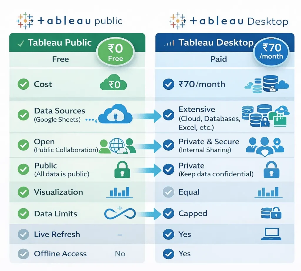
Tableau Public vs Tableau Desktop vs Tableau Cloud: Complete Comparison
Here’s where confusion typically happens. There are three Tableau options, and each serves different needs:
Feature Comparison Table
| Feature | Tableau Public (Free) | Tableau Desktop ($70/mo) | Tableau Cloud ($70/mo) |
|---|---|---|---|
| Cost | ₹0 | ₹55K-80K/month | ₹55K-80K/month |
| Public/Private | Must be public | Can be private | Can be private |
| Data Sources | Files only (Excel, CSV, Sheets) | Databases (SQL, Oracle, AWS) | Databases + Files |
| Live Data Refresh | Manual (every 24h from Sheets) | Automatic | Automatic |
| Offline Work | No | Yes (download desktop) | No |
| Collaboration | View-only comments | Full team collaboration | Full team collaboration |
| Team Features | None | Advanced | Advanced |
| Max Data Size | ~10 million rows | Unlimited | Unlimited |
| Use Case | Learning, portfolios, public projects | Enterprise analytics, private work | Cloud-based enterprise, SaaS |
Quick Decision:
Just learning or building portfolio? → Tableau Public ✓
Working with sensitive/private data? → Tableau Desktop
Enterprise team needing cloud access? → Tableau Cloud
How to Build Your First Tableau Public Dashboard: The Complete 10-Step Workflow
Let’s walk through building a real dashboard from start to finish. I’ll use the Superstore dataset (common sample data) as an example.
Step 1: Create Your Tableau Public Account (5 minutes)
Visit: public.tableau.com
Click “Sign Up” in the top-right corner
Enter your email address
Create a strong password
Click “Sign Up”
Check your email and click the verification link
You’re ready to start ✓
Pro tip: Use a professional email (avoid “xgamer123@gmail.com” if building a portfolio). Your Tableau Public profile is publicly visible.
Step 2: Download Tableau Public Desktop (10-15 minutes)
While you can work entirely online, downloading the free desktop version is recommended for offline work and a better interface.
Visit: tableau.com/products/public/download
Select your operating system (Windows or Mac)
Download the installer (~500MB)
Run the installer and follow prompts
Launch Tableau Public Desktop
Sign in with your account credentials
You now have both online access (web) and offline desktop version for building.
Step 3: Connect to Your Data Source (5-10 minutes)
Real dashboards start with real data.
In Tableau Public Desktop:
Click “Connect to Data” (left side)
Choose your data source:
“Upload” → Select Excel/CSV file from your computer
“Google Sheets” → Link your Google Sheets account
“Sample Data” → Use built-in Superstore dataset
“Open Data” → Access public datasets (World Bank, etc.)
Select your file and click “Open”
Tableau analyzes your data and displays column names and data types
Data understanding matters:
Dimensions = Text/categorical (Country, Product, Date)
Measures = Numbers (Sales, Profit, Quantity)
Tableau automatically classifies your fields—but verify they’re correct.
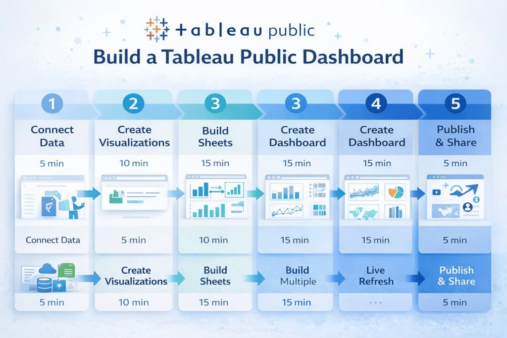
Step 4: Create Your First Visualization (10-15 minutes)
Time to create your first chart.
On Sheet 1:
Drag a Dimension to Rows shelf
Example: “Region”
Drag a Measure to Columns shelf
Example: “Sales”
Tableau auto-generates a bar chart ✓
Boom. That’s it. You just created your first visualization.
Customize your chart:
Click “Show Me” (top-right) to explore other chart types
Drag another field to Color to add a dimension
Click “Automatic” → change to specific chart type (line, pie, etc.)
Example workflow:
Example workflow:
Goal: Show Sales by Region over Time

1. Drag "Region" to Rows
2. Drag "Order Date" to Columns (right-drag, choose "Month")
3. Drag "Sales" to Rows (values automatically sum)
4. Drag "Category" to Color to show breakdown
5. Result: Line chart showing sales trends by region and category
Step 5: Build Multiple Supporting Sheets (30-45 minutes)
Professional dashboards combine 3-5 different visualizations, each exploring different data angles.
Create Sheet 2:
New Sheet → Explore profit by product category
Drag “Product Category” to Rows
Drag “Profit” to Columns
Change to horizontal bar chart
Create Sheet 3:
New Sheet → Geographic analysis
Drag “State/Province” to Rows (or double-click for auto-map)
Drag “Sales” to Color
Shows sales by geography
Create Sheet 4:
New Sheet → Time series
Drag “Order Date” (Month) to Columns
Drag “Sales” to Rows
Create area chart showing seasonal trends
Pro practice: Build 4-5 sheets with different insights before combining them. Each sheet should answer a specific question:
What’s the revenue trend? (time series)
Which regions perform best? (map or bar chart)
What’s our product mix? (pie or stacked bar)
Who are top customers? (table or bar chart)
Step 6: Create Your Dashboard (15-20 minutes)
Now combine all sheets into one interactive view.
In Tableau Public:
Click “New Dashboard” (bottom toolbar)
A blank canvas appears with sheet list on left
Drag sheets onto the canvas in your desired layout
Arrange them logically:
Top: Key trend (time series)
Middle: Regional analysis (map)
Bottom: Product breakdown (bar chart)
Resize components by dragging edges
Use “Automatic” or “Fit Width” layouts for responsive design
Layout best practices:
Most important viz top-left (where eyes naturally look)
Use balanced whitespace (not cramped)
Group related visualizations together
Consider mobile viewing (tall/narrow works better than super wide)
Step 7: Add Filters for Interactivity (10-15 minutes)
This is what makes dashboards interactive, not static reports.
Add a filter:
Right-click on a sheet in your dashboard
Select “Filter”
Choose a field to filter (e.g., “Region”)
Click “Apply to Worksheets” → “Selected Worksheets”
Filter widget appears on your dashboard
Create interactions:
Click on a specific region in your map
Dashboard automatically filters all other charts to show only that region’s data
Users can explore data dynamically ✓
Common filters:
Region/Location → Show data for selected area
Date Range → Adjust time period
Category/Product → Focus on specific product type
Status/Segment → Compare customer segments
Interactive example:
User clicks “North Region” on map → All other charts update instantly to show only North data. User clicks “Electronics” category → Charts update again. This creates an explorable, data-driven experience.
Step 8: Format and Polish for Professionalism (15-20 minutes)
Raw dashboards look unfinished. Formatting makes them portfolio-worthy.
Add dashboard title:
Click “Dashboard” menu → “Edit Dashboard Title”
Give it a professional name: “Sales Performance Dashboard Q1 2025”
Add subtitle: “Interactive analysis of regional sales and profit trends”
Format colors and fonts:
Click “Format” panel (right side)
Worksheet colors → Ensure color accessibility (avoid red-green combos)
Fonts → Use consistent, readable fonts (Tableau default is fine)
Alignment → Center titles, left-align text for readability
Add context:
Drag “Text Box” onto dashboard
Write brief insights: “Total Q1 sales: $X | Best region: North | Top product: Electronics”
Add data source note: “Data source: Internal Sales Database | Updated: Jan 2025”
Professional touches:
✓ Clear title explaining what dashboard shows
✓ Consistent color scheme (max 3-4 colors)
✓ Labeled axes and clear legends
✓ Data source attribution
✓ Key metrics highlighted (cards showing totals)
✓ Mobile-responsive layout
Step 9: Publish Your Dashboard to Tableau Public (5 minutes)
Time to go live.
In Tableau Desktop:
Click “File” → “Publish as…”
Sign in to your Tableau Public account
Choose project name (or create new: “My Dashboards”)
Write a description (appears in search):
Example: “Interactive sales dashboard showing Q1 2025 regional performance, profit trends, and product mix analysis.”
Add tags for discoverability: #sales #analytics #dashboard
Click “Publish” ✓
Your dashboard is now live with a shareable URL.
Step 10: Share and Iterate (Ongoing)
Your dashboard is published, but growth doesn’t stop here.
Share strategically:
LinkedIn: Post about your dashboard with a screenshot
Portfolio website: Embed the link:
public.tableau.com/your-username/viz-nameGitHub README: Include dashboard screenshot and link in projects
Email outreach: Send to hiring managers or collaborators
Get feedback:
Tableau Public shows view counts and interaction metrics
Monitor which charts people click most
Read comments from the community (helpful feedback!)
Iterate: Improve poorly-performing visualizations
Update your data:
If source data changes, re-upload the file
Tableau automatically detects changes
Your published dashboard updates instantly ✓
Track progress:
Month 1: 10 views
Month 2: 50 views (after sharing on LinkedIn)
Month 3: 200+ views (if dashboard provides unique value)
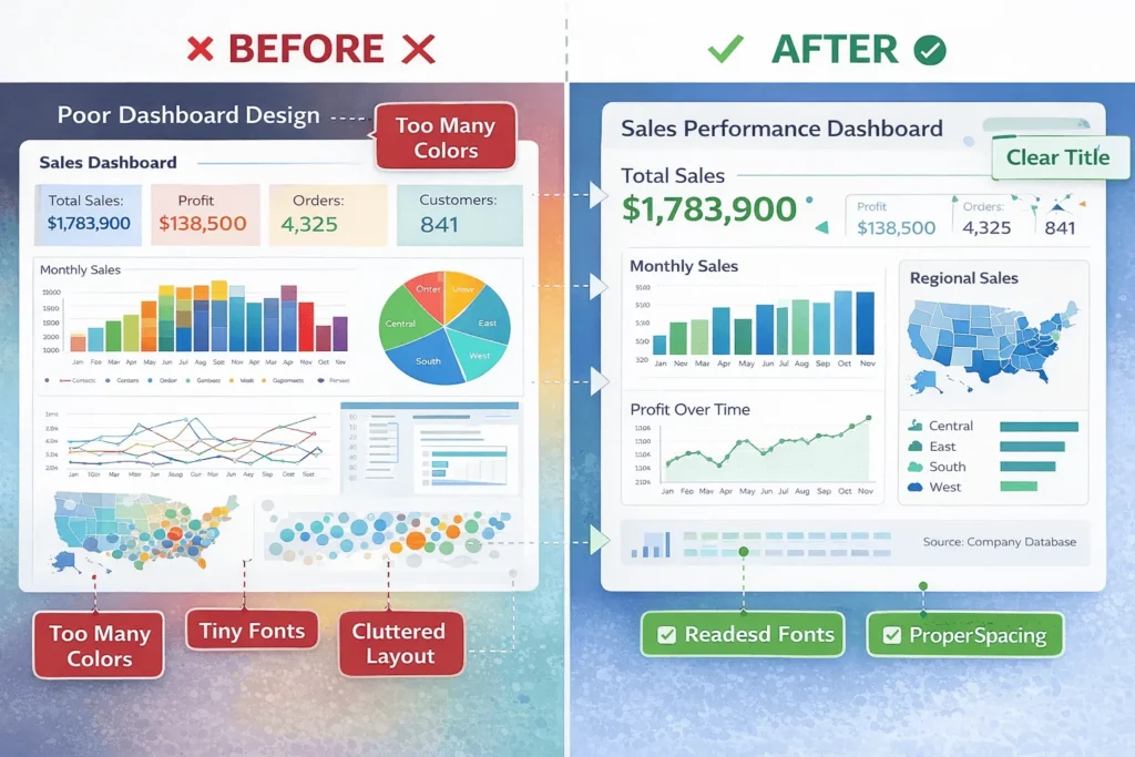
Best Practices for Professional Tableau Dashboards
Not all dashboards look equal. Here’s how to create stunning, insightful dashboards:
Principle 1: Tell a Data Story
❌ Wrong approach:
Throw 8 random charts on a dashboard. Users have no idea what the point is.
✅ Right approach:
Design narrative flow:
Top section: Main insight (headline chart)
Middle: Supporting evidence (breakdowns, comparisons)
Bottom: Detailed analysis (tables, deep-dives)
Example story:
“Our most profitable region is the West. Here’s why: high-margin products dominate there (Electronics). And it’s growing YoY even as other regions plateau.”
Dashboard design:
Top: Map showing West region highlighted
Middle: Bar chart showing products by region
Bottom: Time series showing trend comparison
Users understand the story, not just scattered numbers.
Principle 2: Use Color Strategically
Common mistakes:
Rainbow colors (confusing, unprofessional)
Red + green together (10% of population color-blind)
Too many colors (overwhelming)
Professional color palettes:
Monochromatic: Shades of one color (blue to dark blue)
Diverging: Light-to-dark with middle neutral (good for positive/negative)
Accent: Neutral base with one highlight color (red bar chart showing outliers)
Rule: Use 2-4 colors maximum. Reserve red/bright colors for important data.
Principle 3: Responsive Design for Mobile
Most dashboard viewers use mobile.
Design for smaller screens:
Stack visualizations vertically (not side-by-side)
Avoid tiny text (minimum 12pt)
Use “Fit Width” layout (adapts to screen size)
Test on phone (Tableau Public works on mobile)
Principle 4: Label Everything
Never assume viewers understand your chart.
Critical labels:
✓ Chart title (what is this showing?)
✓ Axis labels (what do numbers represent?)
✓ Legend (what do colors mean?)
✓ Data source (where’s this data from?)
✓ Date updated (how fresh is this?)
Example bad label: Y-axis says “Sales”
Example good label: Y-axis says “Sales (₹ in Thousands)”

How Tableau Public Helps Your Career & Portfolio
Here’s the real value: Tableau Public is your free portfolio platform.
Building a Competitive Data Portfolio
Employers hiring for data analyst, BI analyst, or data science roles want to see:
✓ Real visualizations you created
✓ Understanding of business problems
✓ Communication of insights
✓ Design and polish
Tableau Public dashboards demonstrate ALL of this. A hiring manager viewing your portfolio sees:
“They know Tableau” ← Industry-standard tool
“They can communicate insights” ← Clear, polished dashboards
“They understand design” ← Professional appearance
“They can complete projects” ← Multiple published dashboards
Real Portfolio Examples That Impress Employers
Dashboard #1: “Sales Analysis Dashboard”
Connects to public e-commerce data
Shows sales trends, geographic breakdowns, customer segments
Demonstrates: Data connection, visualization design, interactivity
Dashboard #2: “COVID-19 Vaccination Tracker”
Uses public health data
Shows country-by-country vaccination rates
Demonstrates: Map visualization, real-world relevance, timely insights
Dashboard #3: “Job Market Analysis”
Analyzes Glassdoor/Indeed public data
Shows salary trends, skill demand, growth industries
Demonstrates: Data cleaning, relevant insights for job seekers
Employer reaction: “This person knows how to ask questions, find data, and communicate answers. Let’s interview them.”
Social Proof & Network Effects
Tableau Public has a vibrant community:
Viz of the Day: Featured dashboards get 10,000+ views
Authors you can follow → Get notified when they publish
Upvotes and comments → Community validation
Galleries by theme → Your work gets discovered
Real story:
A student published a dashboard analyzing gaming industry trends. It got featured in “Viz of the Day.” 2,000+ views later, a game company saw it, reached out, and offered an internship.
Limitations of Tableau Public: What You Can’t Do
Before diving in, understand where Tableau Public falls short:
Limitation #1: Data Must Be Public
The Big One: All your work and data publish publicly online.
What this means:
❌ Can’t use company data (confidential = never use Tableau Public)
❌ Can’t analyze customer information (privacy laws violated)
❌ Can’t work on proprietary datasets
✅ CAN use public datasets (World Bank, Kaggle, government data)
✅ CAN use synthetic/example data
✅ CAN use your own personal data
Workaround: Use anonymized or aggregated data. Instead of real sales figures, use sample data that shows similar patterns.
Limitation #2: Data Size Restrictions
Maximum: ~10 million rows per dataset | 10GB per account
What this means:
Small datasets (< 1 million rows) = ✓ No problem
Medium datasets (1-5 million rows) = ✓ Usually fine
Large datasets (10 million+ rows) = Must aggregate/sample
Real impact:
Most student and freelancer projects are well under these limits. Only massive enterprise datasets hit the ceiling.
Limitation #3: No Live Database Connections
You can’t connect directly to SQL Server, Oracle, AWS, etc.
What this means:
❌ No real-time dashboards (that auto-update from database)
✓ Must export data as Excel/CSV first
✓ Publish update by re-uploading file (~24h refresh from Google Sheets)
Workaround: Use Google Sheets to pull live data from APIs, then connect Tableau to Sheets (auto-updates every 24h).
Limitation #4: No Offline Access for Published Dashboards
Dashboards only exist online.
What this means:
❌ Can’t save published dashboards locally
❌ Published dashboards need internet to view
✓ Can download Tableau workbooks locally (before publishing)
Why it matters: If Tableau Public goes down, viewers can’t access your dashboard. Not ideal for critical business use.
Limitation #5: No Private Collaboration
All dashboards are publicly visible (though you can hide from profile)
What this means:
❌ Can’t share password-protected dashboards with team
❌ Link is still searchable (not truly “private”)
✓ Works for portfolios
✓ Doesn’t work for team projects
For team collaboration: Use Tableau Server or Tableau Cloud (paid).
Limitation #6: No Automated Data Refresh
Data doesn’t auto-update from databases.
What this means:
❌ If source data changes, you must manually re-upload
❌ Not suitable for real-time operational dashboards
✓ Fine for static analysis or periodic updates
✓ Google Sheets integration updates every 24h (only option for refresh)
📄
Key Takeaways: Your Tableau Public Checklist
✓ Tableau Public is 100% free — All features come at no cost
✓ Drag-and-drop interface — No coding required; intuitive for beginners
✓ Professional outcomes — Publish portfolio-ready dashboards
✓ Community-driven — 2+ million users learning and sharing
✓ Suitable for learning — Start here before investing in paid tools
✓ Career-building — Employers recognize Public dashboards as real work
✓ Limitations exist — Data must be public, no private dashboards, no live databases
✓ Ideal use cases — Portfolios, learning, public data analysis, personal projects
The bottom line: If you want to learn data visualization without cost, build a portfolio, or visualize public datasets, Tableau Public is unbeatable.
Next Steps: Your Action Plan to Start Today
For Complete Beginners:
This Week:
Sign up at public.tableau.com (5 minutes)
Download Tableau Public Desktop (10 minutes)
Watch one free tutorial (30 minutes)
Connect to sample Superstore data and create ONE chart (30 minutes)
Next Week:
Build 4-5 supporting visualizations (2-3 hours)
Combine into a dashboard (1 hour)
Add filters and polish (1 hour)
Publish to Tableau Public (5 minutes)
Goal: Your first dashboard published by end of month
For Intermediate Users:
Create 3-4 dashboards on different topics
Use public datasets (World Bank, Kaggle, government data)
Share on LinkedIn with analysis insights
Comment on others’ work and join community
For Portfolio Building:
Create dashboards solving specific business problems
Add to your personal website (embedded dashboards)
Include in GitHub README with project context
Share on LinkedIn with analysis narrative (not just link)
Target 50+ views per dashboard as success metric
Resources to Accelerate Your Learning
Official Tableau Resources:
Tableau Public Homepage — Main platform
Tableau Public Learning — Official free courses
Tableau Sample Datasets — Pre-built datasets to practice on
Community Galleries — View 1000s of dashboards for inspiration
Free Learning Platforms:
Tableau Public Tutorial Videos — YouTube official channel
Mode Analytics SQL Tutorial — Learn data skills to prepare data for Tableau
Kaggle Datasets — Find interesting public datasets
Dashboard Inspiration:
Viz of the Day — Daily featured dashboards (amazing inspiration)
Top Tableau Authors — Follow skilled creators
Makeover Monday — Weekly data visualization challenge (portfolio building!)
Related Articles from StartupMandi:
While Tableau Public is excellent for visualization, it’s also important to understand the broader data analytics landscape. Explore more resources on business analysis and data-driven decision making at StartupMandi.
Conclusion: Your Tableau Public Journey Starts Now
Building professional data dashboards should not require ₹50,000+ enterprise licenses.
Tableau Public proves that. For zero rupees, you get:
✅ Industry-standard visualization tools
✅ Portfolio-building capability
✅ Access to a 2+ million person learning community
✅ Career-ready outputs
✅ Lifelong learning platform
The barrier to entry is gone. The only thing separating you from a published dashboard is 3-4 hours of work.
Whether you’re a:
Student wanting to build portfolio credentials
Job seeker differentiating yourself from other candidates
Freelancer adding data skills to your toolkit
Career changer exploring the analytics field
Data enthusiast learning visualization
…Tableau Public is your free, zero-risk starting point.
Your first steps:
Today: Sign up and download Tableau Public
This week: Build one chart using sample data
Next week: Create your first complete dashboard
Next month: Publish and share (get your first 100 views!)
Start building. Share your work. Join a global community of data storytellers. Advance your career.
That’s what Tableau Public makes possible.
Happy visualizing! 📊
Tags
Share your love

Nitesh Roy
Founder @ StartUpMandi. Working in various Domains since 2017. Like, Sales & Marketing, Web & App Development, Graphic Design, Digital Marketing, SEO, Business Development. Hobby: Research & Innovation, Photography, Travelling, Cooking.